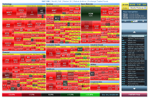
FinViz is a site that aggregates a lot of financial information and presents it in interesting and innovative ways. The centrepiece of the site is a very impressive “squarified treemap” (see here for an interesting article on the history of the treemap as a data visualization tool). The map is apparently built using the Google Maps API, and is densely packed with information.
A couple of snapshots I found particularly interesting… here is the 3-month performance treemap for the S&P 500:

And here is the 1-week performance treemap:

It is a pretty interesting comparison – check out the tech sector hammering in the 3-month view (AAPL and GOOG particularly).
As an aside – has anyone else seen any interesting examples of treemaps or Voronoi maps (apart from the usual disc space explorers)?