Categories
Coding Finance R Statistics

Fooled By Randomness

I recently read the great book Fooled By Randomness by Nicholas Nassim Taleb. There is a nice illustrative example in there on the scaling property of distributions across different time scales. The example is formulated as the hypothetical example of a dentist who has set up a home trading environment and started to invest in some assets (say stocks). The dentist has access to real-time market data and thus can check in on their current investment portfolio valuation at any point in time.

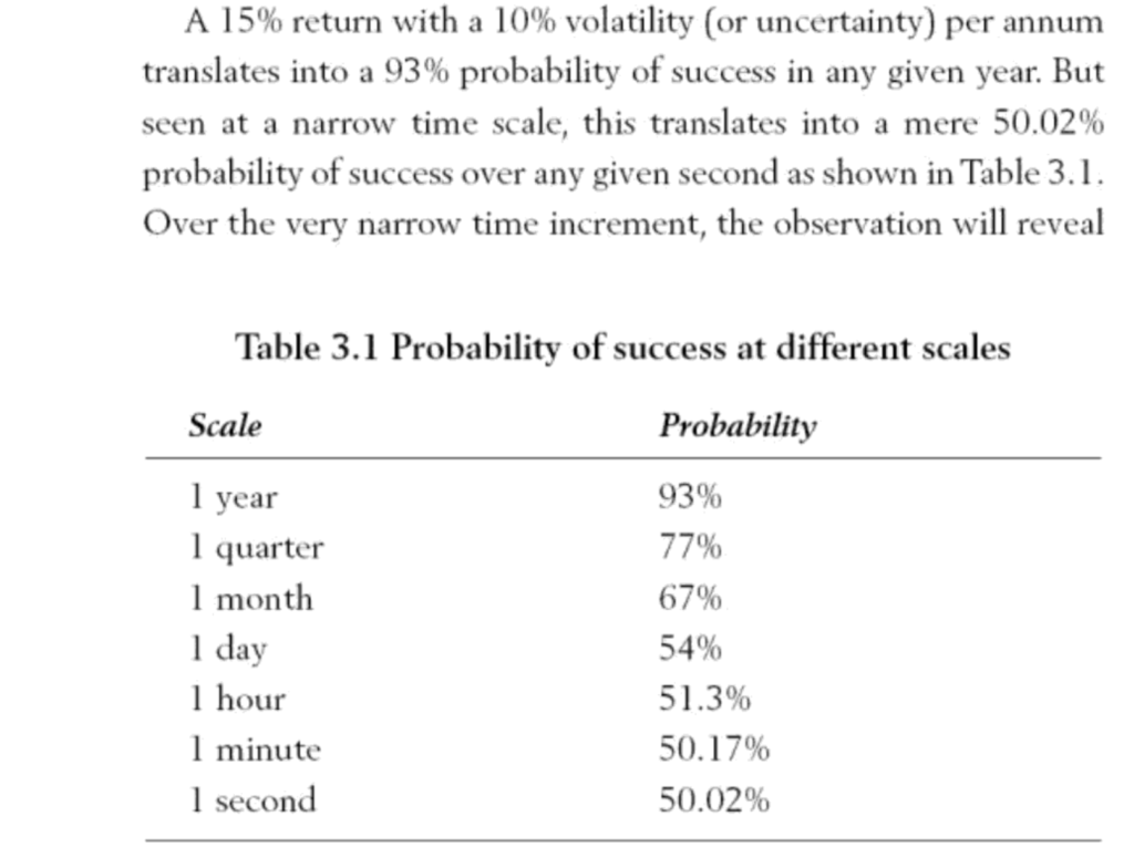
The investment portfolio has an expected annual return of 15% and volatility of 15%. The assertion in the book is that the more frequently the dentist appears to check the performance of the portfolio, the worse it will seem to perform(see the table below). The question is why, as at first glance it appears counter-intuitive.

The answer is as follows – if we assume a normal distribution for the portfolio returns, the parameters above define a distribution with a mean of 15% and a standard deviation of 10%, .i.e. $\mathcal{N}(0.15, 0.10)$

We can represent this in R as follows:

mu <- .15
sigma <- .1
x <- seq(-2,2,.01)
y <- dnorm(x,mean = mu, sd = sigma)
qplot(x,y) + geom_line() + geom_vline(aes(xintercept=mu),color='red') + geom_vline(aes(xintercept=c(mu-sigma,mu+sigma)),linetype=2)

The graph shows the implied distribution plus the mean (red line) and standard deviation (dashed lines)

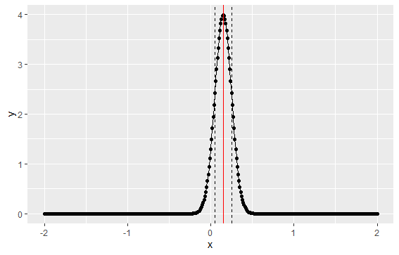
Under this implied distribution, 2 standard deviations (or 95%) results in a return spanning -5% to +35%:

mu + 2*sigma
[1] 0.35
mu - 2 *sigma
[1] -0.05

Looking again at the table from the book above – if we calculate success as a return > 0, then we can calculate the probability of success for the distribution above. We can calculate this using the the normal cumulative distribution – which is basically the the sum of the area under the normal curve above – and find out what this value is for 0.

In R, pnorm() gives us the area under the curve. Actually it gives us $P(X<=0)$ so in order to calculate success $(P(X>0))$ we need to calculate the inverse probability:

1-pnorm(0,mean = mu, sd=sigma)
[1] 0.9331928

So the probability of success over one year is 93%, which matches the table above.

Now what happens if the dentist checks their portfolio more frequently – i.e. what does the return look like over 1 quarter as opposed to 1 year? In order to calculate this, we need to adjust the parameters to scale it to a quarterly distribution. So $\mu_Q = \frac{\mu_A}{4}$ and $\sigma_Q = \frac{\sigma_A}{\sqrt{4}}$, i.e. the mean will be divided by 4 to convert to quarters, and the standard deviation will be divided by the square root of 4, as volatility scales with the square root of time.

1-pnorm(0,mean = mu/4, sd=sigma/sqrt(4))
[1] 0.7733726

So we can see that moving from an annual to a quarterly distribution has lowered the probability of success from 93% to 77%

Similarly if we now move from quarterly to monthly, the distribution will be a $ \mathcal{N}{\frac{\mu_A}{12}, \frac{\sigma_A}{\sqrt{12}}}$ distribution:

1-pnorm(0,mu/12, sigma/sqrt(12))
[1] 0.6674972

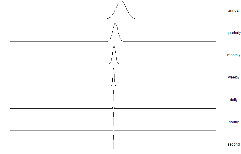
Which is roughly 67%. Further, we can tabulate the various scaling factors all the way from 1 (annual) to 31536000 (1-second horizon) and calculate the probability of success for each time horizon. We can see the success probability diminish from 93% down to 50% at a one-second resolution.

factors <- c(1,4,12,52,365,8760,31536000)
sapply(factors, function(x) success(mu, sigma, x))
[1] 0.9331928 0.7733726 0.6674972 0.5823904 0.5312902 0.5063934 0.5001066

To make it clearer we can calculate the density of each distribution and plot it:

mu <- 0.15
sigma <- 0.1
x <- seq(-2,2,.01)
factors <- c(1,4,12,52,365,8760,31536000)
names <- c('x','annual','quarterly','monthly','weekly','daily','hourly','second')

# Calculate the density for the distribution at each timescale 
tab <- data.frame(x=x)
for (f in seq_along(factors)) {
  tab <- cbind(tab, dnorm(x, mu/factors[f], sd=sigma/sqrt(factors[f])))
}

# Plot each density in a separate panel
colnames(tab) <- names
ggplot(melt(tab,id.vars = 'x'), aes(x=x)) + geom_line(aes(y=value)) + facet_grid(variable~.,scales = 'free') + xlab('') + ylab('') + theme_void() + theme(strip.text.y = element_text(angle = 0))

Categories
Coding Finance R Statistics

Market Making and The Win/Loss Ratio

The article https://online.wsj.com/public/resources/documents/VirtuOverview.pdf is a neat little illustration of a simple asymptotic toy distribution given an initial probability of a win or loss per-trade. It is used as an example to illustrate the basic methodology behind the working market-maker business – develop a small edge and scale this up as cheaply as possible to maximise the probability of overall profit.

If we take $p=0.51$ as the probability of a win per-trade and then after $n$ transactions we will have a number of ‘wins’ k that will vary from 0 to n. We model each trade as the outcome of a binomial 0-1 trial.

In order to come out at breakeven or better, the number of wins k needs to be at least $\frac{n}{2}$. Using the binomial distribution this can be modelled as:

$P\left(n>\frac{k}{2}\right) = \sum_{\frac{k}{2}}^\infty \frac{n!}{k!(n-k)!}p^k(1-p)^{n-k}$

As the binomial distribution converges to a normal $\mathcal{N}(np, np(1-p))$ as n gets large, we can use the distribution below to model the win/loss probability over n:

$ \int_{\frac{k}{2}}^\infty \mathcal{N}\left(np, np(1-p) \right) dx $

Which is

$ \int_{\frac{k}{2}}^\infty \frac{1}{\sigma\sqrt{2}\pi}e^{-\frac{1}{2}\frac{x-\mu}{\sigma}^2} dx$

Where $\mu=np$ and $\sigma^2=np(1-p)$

This can be modelled in R

> p <- 0.51
> n <- 100
> 1-pnorm(q=n/2, mean=n*p,sd=sqrt(n*p*(1-p)))
[1] 0.5792754
> n <- 1000
> 1-pnorm(q=n/2, mean=n*p,sd=sqrt(n*p*(1-p)))
[1] 0.7364967

Showing that with a win probability of 51% 100 trades gives us a 57% probability of breakeven or better and 1000 trades gives us a 73% chance of breakeven or better.

We can plot the probability of breakeven holding p constant and changing n from 1 to 1000:

 n<-seq(1,1000)
> y <- 1-pnorm(q=n/2, mean=n*p,sd=sqrt(n*p*(1-p)))
> library(ggplot2)
> library(scales)
> qplot(n,y)+scale_y_continuous(label=percent)

Which produces the following graph

Which shows the convergence to a sure 100% probability of profit as n gets large.

To make it more interesting we can generate different paths for n from 1 to 10000 but also vary the win probability from say 45% to 51% and look at the paths as we vary n and p:

n <- seq(1,10000)
p<- 0.5
y <- 1-pnorm(q=n/2, mean=n*p,sd=sqrt(n*p*(1-p)))
plot(n, y, type='l', ylim=c(0,1))

probs <- seq(0.45, 0.55, length.out = 100)
for (pr in seq_along(probs)){ 
 p<-probs[pr]
 y<-1-pnorm(q=n/2, mean=n*p,sd=sqrt(n*p*(1-p)))
 lines(x=n,y=y,col=ifelse(y<0.5,rgb(1,0,0,.5),rgb(0,1,0,.5)))
}

Which shows the probabilities of breakeven or better given a number of different starting win/loss probabilities and a varying number of trades. The path with $p=0.5$ is shown in black.

Categories
Finance R Statistics

Density Estimation of High-Frequency Financial Data

Frequently we will want to estimate the empirical probability density function of real-world data and compare it to the theoretical density from one or more probability distributions. The following example shows the empirical and theoretical normal density for EUR/USD high-frequency tick data \(X\) (which has been transformed using log-returns and normalized via \(\frac{X_i-\mu_X}{\sigma_X}\)). The theoretical normal density is plotted over the range \(\left(\lfloor\mathrm{min}(X)\rfloor,\lceil\mathrm{max}(X)\rceil\right)\). The results are in the figure below. The discontinuities and asymmetry of the discrete tick data, as well as the sharp kurtosis and heavy tails (a corresponding interval of \(\approx \left[-8,+7\right]\) standard deviations away from the mean) are apparent from the plot.

tick density
Empirical and Theoretical Tick Density

We also show the theoretical and empirical density for the EUR/USD exchange rate log returns over different timescales. We can see from these plots that the distribution of the log returns seems to be asymptotically converging to normality. This is a typical empirical property of financial data.

density_scaled
Density Estimate Across Varying Timescales

The following R source generates empirical and theoretical density plots across different timescales. The data is loaded from files that are sampled at different intervals. I cant supply the data unfortunately, but you should get the idea.

[source lang=”R”]
# Function that reads Reuters CSV tick data and converts Reuters dates
# Assumes format is Date,Tick
readRTD <- function(filename) {
tickData <- read.csv(file=filename, header=TRUE, col.names=c("Date","Tick"))
tickData$Date <- as.POSIXct(strptime(tickData$Date, format="%d/%m/%Y %H:%M:%S"))
tickData
}

# Boilerplate function for Reuters FX tick data transformation and density plot
plot.reutersFXDensity <- function() {
filenames <- c("data/eur_usd_tick_26_10_2007.csv",
"data/eur_usd_1min_26_10_2007.csv",
"data/eur_usd_5min_26_10_2007.csv",
"data/eur_usd_hourly_26_10_2007.csv",
"data/eur_usd_daily_26_10_2007.csv")
labels <- c("Tick", "1 Minute", "5 Minutes", "Hourly", "Daily")

par(mfrow=c(length(filenames), 2),mar=c(0,0,2,0), cex.main=2)
tickData <- c()
i <- 1
for (filename in filenames) {
tickData[[i]] <- readRTD(filename)
# Transform: `$Y = \nabla\log(X_i)$`
logtick <- diff(log(tickData[[i]]$Tick))
# Normalize: `$\frac{(Y-\mu_Y)}{\sigma_Y}$`
logtick <- (logtick-mean(logtick))/sd(logtick)
# Theoretical density range: `$\left[\lfloor\mathrm{min}(Y)\rfloor,\lceil\mathrm{max}(Y)\rceil\right]$`
x <- seq(floor(min(logtick)), ceiling(max(logtick)), .01)
plot(density(logtick), xlab="", ylab="", axes=FALSE, main=labels[i])
lines(x,dnorm(x), lty=2)
#legend("topleft", legend=c("Empirical","Theoretical"), lty=c(1,2))
plot(density(logtick), log="y", xlab="", ylab="", axes=FALSE, main="Log Scale")
lines(x,dnorm(x), lty=2)
i <- i + 1
}
par(op)
}
[/source]